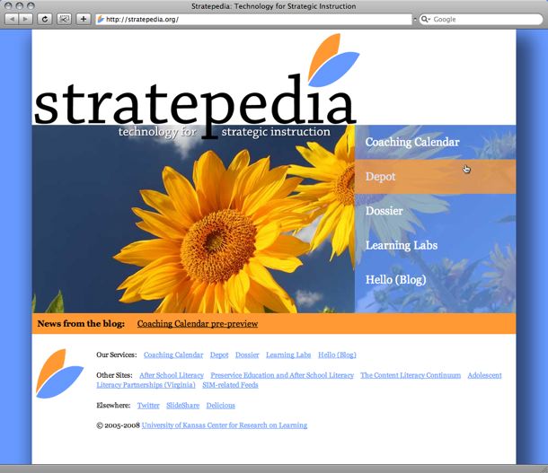
Yesterday's project: New look for Stratepedia.org
Amazing what I’ll do when I’m putting off other work. A little background: Stratepedia, the hub for pretty much all of my projects at work, got off to a rough start a couple of years ago. The plan was to make a big splash as we migrated away from a long, somewhat confining domain name. Unfortunately, it didn’t work out–due to a domain registration issue, Stratepedia was kind of forced to make its debut earlier than planned. As a result, I didn’t get much time for logos, visual identities, and all that.
My first pass at it looked bad. I don’t even have any screen shots of the first incarnation of the site. Then, for that last year-plus or so, we’ve fun a site with a nice corkboard design that Amber put together. It did the job, but recently I came to realize that it was time for Stratepedia to have more of an identity of its own, starting with a logo and moving on to my attempts to bring a Kansas flair to our work (see Depot, etc. to get a feel for my general take on ed-tech website design; it’s kind of my reaction to overuse of silly “high tech” designs like Matrix-y letters, Star Trek fonts and green grids, and/or little red schoolhouses and apples). Enough setting it up–here it is:

That’s it–one page, linking out to everything we do. Cranked out over the course of about five hours yesterday, including an hour or so of browser fine-turning (if you’re looking at it in IE it won’t quite look like the screen shot; I had to make adjustments due to how that lame browser handles overlapping <div> elements and PNG files). At the moment I still think it’s the prettiest thing I’ve ever put on the web.
The logo is kind of, sort of a reaction to the greenification of the world–I’ve been wondering if it’s a fad or here to stay. I hope it’s the latter, but the cynic in me has doubts. Anyway, what started as me trying to come up with a Web 2.0-ish wheat shock turned into something much more simple; a pair of wings. I know it’s not the most original thing in the world, but I like it and think I have something I can use standalone (like, the Stratepedia Twitter account uses just the wings as a user picture) when needed.
In theory, I’m going to start rotating out the photograph. The sunflower shot currently online is a purchased stock photo; I’d like to solicit my photograph-taking friends to help build a rotating gallery of original, Kansas-themed pictures as a little value-added service (again, did I mention how much I dislike ed-tech web design?). This one will do in the meantime.
