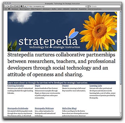
I love one-page websites.

Here’s a site redesign I put together over the course of a couple of hours between yesterday and today: A new look for Stratepedia’s hub site. I do this about once a year ([here’s las—for-stratepediaorg.html)). One page, with a focus on moving people on to the tools they actually want to use. It’s also going to afford more room for growth than the last one did, in terms of having room to link to major new products and initiatives. Now it’s just a matter of adding another <div> to the grid.
I took the opportunity as an excuse to mess with Blueprint in a productional sense, in part because the new KU template (which I admittedly seldom use) uses Blueprint, and because I was curious about how much time I might really save with it. I probably did save some time with the grid–especially in the uniform boxes near the center of the page–but it felt kind of dirty, like I was using tables for layouts.
For larger projects, I may give Compass another look–I do really like Sass, and Haml’s growing on me, and I guess there’s nothing saying I have to use a CSS framework to use any of them.
